User Friendly Deliverables

Building better bridges into development.
A report from a user research vendor came across my desk one morning. It was just what we needed: information on how users performed specific tasks in a tool we were architecting. Gold was at my finger tips. But though the report was elegantly designed (I was even a little jealous about it), sifting through the relevant information proved unwieldy. Findings were delivered not across needed features, but across 26 users, followed up with detailed personas. I wanted to see the issues laid out by feature areas and roles. But instead, I had to read through all 26 interviews to understand painpoints and delights of the tool use. Our UX team did not have bandwidth to sort through this; and in a few days, Product Managers expected user stories at the end of the sprint. My mind spun: how could this valuable information be better synthesized, in one page view, and done quickly?
Fast forward four months later. My team had just delivered a report to a client, detailing what needed to be fixed in Checkout. We gave examples, we explained clearly what needed to be addressed. Or so we thought. Two weeks later we followed up, only to discover that the Checkout implemented was worse! This time pie was on our team's face. How could we have more clearly delivered results?
Delivering More User Friendly Results
Too often user research falls short delivering results that translate into action. These two above stories are not unusual, and speak to the need for specific tools and strategies for delineating, clarifying and prioritizing findings. Tools such as reports that boil down findings to key insights and specific recommendations, personas, and journey mapping remain invaluable. But even so, recommendations can still be lost in translation. To this end, I've successfully experimented with mental models, prototypes, and prioritizing findings.
In response to the first described report, filled with rich data from 26 users, I made a large spreadsheet (I know, how archaic). I bucketed issues across roles, tasks and features, totally 267 findings. Still this was too much for the team to rapidly digest, so I consolidated these further into a mental model, showing the issues as users proceeded through different tasks, describing behavior above and expressed (or intepretted) needs below. In one view, needs could be digested, and then easily crafted into user stories.
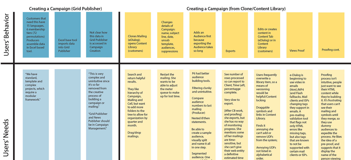
Though "scrappy", this clearly conveyed what users desired within each task, and allowed the UX team to deliver substantial user stories, rooted in research, within the necessary timeframe.
Responding to the "worse Checkout", I worked with teammates to quickly build a prototype detailing what the Checkout should look like. We delivered this to the client, and changes were quickly updated. Here, it can't be emphasized enough how vital it is to communicate clear changes via prototypes and/or wireframes. Ambiguity is minimized and recommendations are more transferrable, and therefore more actionable.
Hitting Home Runs
You can do all of the above though, and still witness research get derailed. Enter in roadmapping. Whenever I deliver research findings, new stakeholders come out of the woodwork. The roadmap discussions quickly veer off from the user: the loudest voices of politics and budgetary constraints dominate. In this cacaphony, too often teams get bogged down fixing features that at the end of the day don't matter as much to users, while the feature enhancements deemed necessary are overlooked, or put into the "long term" roadmap. Earlier I made the mistake of plotting UX Impact against Level of Effort in an effort to solidify priorities with stakeholders. But this approach fed this roadmapping behavior, resulting predictatively in the user's needs dwarfed by budget constraints and the political landscape. Part of a user researcher's responsibility is to tease out which feature enhancements matter and which don't, and keep that user front and center in the midst of these discussions.
The Kano Model does just this. Developed by Noriaki Kano in 1984, Kano's original intent was to find ways to measure delight. He argued against the conventional wisdom that dictated innovation happen soley in response to customer's complaints. Instead, he argued, there should also be a way to measure delight, and use this as a metric for prescribing innovation. Simply put, users are asked about particular features, both positively (if the feature was present), how would they feel, and if it was absent how they would feel. Those desired features become a higher priority, while those features that users cannot live without become must-haves.
Features needed and plotted this way, on their own terms render them harder to dismiss. The Kano model serves well for delineating feature priority, while keeping the user front and center.
Used together, in conjuction with standard tools, mental models, prototypes, and the Kano model serve well in translating results into actionable change.